Tổng hợp đề thi IELTS Writing Task 1 dạng bài Line Graph
IELTS Task 1 dạng bài Line Graph luôn là một trong những dạng thường gặp nhất trong đề thi IELTS Writing. Trong bài viết dưới đây, TAK12 sẽ hướng dẫn các bạn cách làm. Đồng thời cũng tổng hợp lại những đề thi Line Graph đã xuất hiện trong những năm vừa qua. Hãy cùng theo dõi để nắm chắc điểm phần thi này nhé!
1. Các bước làm dạng đề Line Graph
Line graphs là dạng biểu đồ trong đó có chứa một hoặc một số đường, mỗi đường biểu diễn cho sự thay đổi của một yếu tố nào đó qua nhiều mốc trong một khoảng thời gian (có thể là tuần, tháng, năm, thập kỷ…). Nhiệm vụ của thí sinh là viết một đoạn văn ít nhất 150 từ để miêu tả thông tin hiển thị trong biểu đồ mà không nêu quan điểm của mình trong bài viết.
Để hoàn thành bài viết line gaph, ta có 4 bước:
-
Bước 1: Phân tích đề bài
-
Bước 2: Viết introduction
-
Bước 3: Xác định ý và viết overview
-
Bước 4: Lựa chọn, nhóm thông tin và viết 2 đoạn detail.
4 bước trên đều có thể áp dụng khi viết 2 dạng line graph trong IELTS Writing task 1 dưới đây:
-
Dạng line graph có ít hơn 3 đường
-
Dạng line graph có nhiều hơn 3 đường
2. Các mẫu đề thi:
2.1. Đề thi IELTS Writing ngày 17/06/2017
Bài tham khảo:
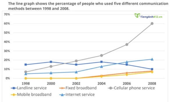
The line graph gives data about the number of users of 5 different services of communication worldwide from 1998 to 2008.
Overall, cell phone and Internet services became more and more popular, and the others similarly experienced minimal growth over the years.
In 1998, the figures for cell phone and Internet users started at around 5 per 100 inhabitants. They both increased over the remaining years, with cell phone service gaining the higher position in 2008, at more than 60 users per 100 inhabitants. This number was approximately three times as much as that of Internet service in the same year.
Meanwhile, throughout this 10-year period, little change was seen in the use of landline service, with about 15 users per 100 inhabitants. Also, mobile and fixed broadband had yet to be introduced by 2002. The figures for these two services rose slightly to roughly 5 users per 100 inhabitants in the last year.
2.2. Đề thi IELTS Writing ngày 06/01/2018
Bài tham khảo:
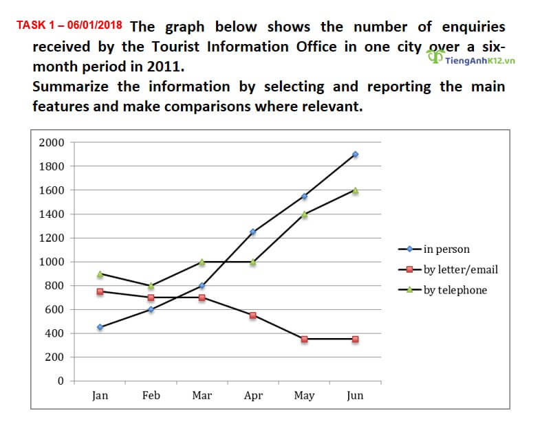
The graph demonstrates the number of questions received by the Tourist Information Office in one city over the first half of the year 2011. Overall, the rate of enquiries received in person or by telephone each month increased over this period, whereas this figure decreased for enquiries received by letter or mail.
In January 2011, it can be seen that enquiries in person were the fewest, at around 400 that month, compared to around 900 by telephone and 780 by letter or email. However, by June, while this number of enquiries for in person and by telephone has risen to 1900 and 1600 respectively, it has fallen to less than 400 by letter or mail.
It can also be seen that in-person enquiries increased every month, surpassing enquiries by letter or email for the first time in March, and enquiries by telephone for the first time in April. Meanwhile, the number of enquiries by letter or email was uniformly lower than that by telephone across the period, with the gap between the two widening from around 100 in January to more than 1200 in June.
2.3. Đề thi IELTS Writing ngày 18/07/2019
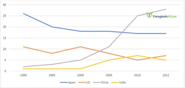
The graph below shows the percentage of Australian exports to 4 countries from 1990 to 2012.
Bài tham khảo:
The given line graph illustrates the proportions of Australian products exported to four countries between 1990 and 2012.
In general, while Australian exports to China and India increased over the period, the US and Japan saw a decline in products imported from Australia. In addition, China experienced the biggest increase in exports over the period, making it the biggest export market of Australia from around 2007 onwards.
In 1990, Japan was the leading export market of Australia, receiving over 25% of all exported goods. China, however, received only a mere 5%. By 2012, the percentage of exports to Japan had dropped to below 20%, while the figures for China saw a dramatic rise to almost 30%.
Meanwhile, Australia exported just over 10% of its goods to the US in 1990, which was around ten times higher than the exports to India. Over the following twenty-two years, the figures for the US fluctuated, and dropped to 5% by 2012. The percentage of exports to India, on the other hand, remained unchanged until 2000, and then increased to about 7% in 2010, before dropping slightly to roughly 5% in 2012.
2.4. Đề thi IELTS Writing ngày 11/01/2020
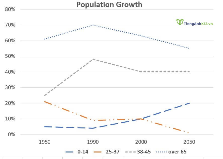
The line graph shows the percentage of New Zealand population from 1950 to 2050.
Bài tham khảo:
The given line chart sets out New Zealand’s population from 1950 to the present day and projections to 2050. Overall, the demo graphical figures tell us that New Zealand has an aging population with the number of people aged between 35 and 64 and 65+ showing upward trends, with the former being projected to become the most prevalent group by 2050. It is also clear that the 15-34 group, albeit dominant from 1950 until the present day, is expected to go through a downturn by 2050.
In 1950, New Zealand’s population aged between 15 to 34 was 32.5%, ranking first among the 4 groups surveyed. This was followed by the figure for the 0-14 group (27.5%), 35-64 (15%) and 65+ (10%). Thereafter, the 15-to-34 age group, despite rising steadily to its high of 45% in the first half, saw a mild drop to 42.5% in 1990, followed by another steeper decline to only 30% in 2010. In the meantime, the population aged between 0-14 also showed a steady downturn and eventually reached 20% in 2010, whereas the two oldest groups 35 to 64 and over 65 experienced increases, with the figures amounting to 20% for the former and 15% for the latter.
By 2050, New Zealand’s population aged 35 to 64 and over 65 will have reached 35% and 20% respectively, with the former group being projected to be the dominant part of the population. Demographics for the two youngest groups, on the other hand, are expected to drop, eventually amounting to a little lower than 30% for the 15-to-34 group and a negligible 10% for the 0-to-14 group.
2.5. Đề thi IELTS Writing ngày 10/04/2021
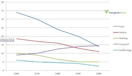
Describe the change in the share of total expenditure in a European country from 1960 to 2000.
Bài tham khảo:
The line graph delineates expenditure on different life aspects in an unspecified European country from 1960 to 2000. The initial impression from the chart is that spending on food, leisure, transport and fuel/energy generally decreased, with food undergoing the most dramatic downturn while expenses on transport showed an upward trend.
In 1960, roughly 35% was spent on food, ranking first among the five classifications surveyed. This was followed by leisure (20%), clothing (10%), and transport (9%). Allocations for fuel/energy were insignificant, accounting for only 5%.
Over the next 40 years, spending on food underwent a steady decrease, and by 2000, it had seen a more than twofold drop to its low of only 15%. Similar patterns are evident in leisure, clothing and fuel/energy, with all three categories seeing decreases to 11%, 6% and 4% respectively. In contrast, the transport was the only one to see an increase in spending, with its figure amounting to 15% in 2000.
2.6. Đề thi IETLS Writing ngày 17/07/2021
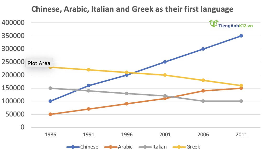
The graph gives information about the number of people in Australia who used Chinese, Arabic, Italian or Greek as their first language.
Bài tham khảo
The line graph shows information about four groups of speakers who use languages other than English as their mother tongue from 1986 to 2011.
Overall, the figure of native speakers of Chinese and Arabic experienced steady increases, with the number for the former seeing the fastest growth. In addition, the number of Italian and Greek speakers saw slight but steady declines.
Both Chinese and Arabic speakers increased in quantity. Specifically, the former rose from just over 100,000 in 1986 to about 350,000 in 2011, whilst the latter also saw an increase, albeit less pronounced, from 50,000 in 1986 to 150,000 in 2011.
Speakers of the two European languages, in the meantime, underwent opposite patterns. The figure for people who spoke Greek as their mother tongue fell gradually from around 225,000 in 1986 to approximately 175,000 in 2011. Similarly, Italian speakers also underwent a decrease of about 40,000 from 150,000, making Italian the least spoken language of the four after 2001.
2.7. Đề thi IELTS Writing ngày 3/03/2022
Bài viết tham khảo:
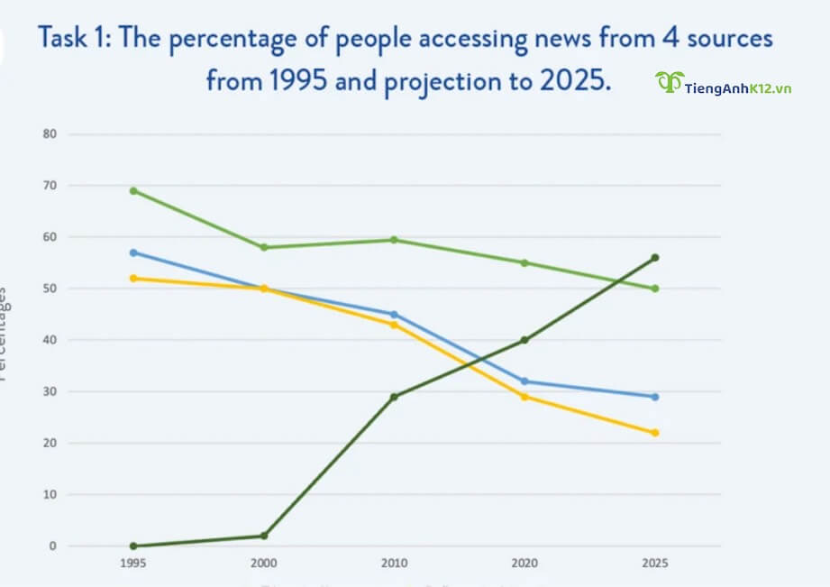
The line graph shows how the proportion of people getting news from 4 different sources, namely TV, newspapers, radio, and the internet, has changed since 1995 with projections until 2025.
Overall, it is clear that updating news on the internet has increased in popularity, and this trend is projected to continue, while the reverse is true for the remainder, making the gaps between the four means of media narrow substantially in the second half of the period in question.
TV remains the dominant means throughout most of this period, with roughly 70% of citizens using it in 1995, falling to under 60% in 2000. Having plateaued until 2010, this figure then saw a steady decrease. This is expected to continue, reaching the lowest point of 50% in 2025.
The use of newspapers and radio is similar over the three decades. From around 58% and 52% respectively in 1995, the percentages of people getting news from both sources declined to an equal 50% five years later. There have been considerable decreases to more or less than 30% at present, and the figure for newspapers is predicted to fall slightly to under 30% in 2025, while that for radio will fall more significantly by approximately 10%.
In the first year, there was hardly any person getting updated on news via the internet. However, it experienced a negligible increase in 2000 followed by a surge to just above 40% in 2022, overtaking radio and newspapers in 2018 and 2019, respectively. The prediction shows that this figure should continue to rise dramatically to a peak of 58% in 2025.
3. Từ vựng thường dùng:
- projection (n): sự dự đoán
- increase in popularity (collocation): tăng về độ phổ biến
- the reverse is true (collocation): điều ngược lại thì đúng
- narrow (v): thu hẹp
- dominant (adj): nổi trội, chiếm ưu thế
- plateau (v): không thay đổi
- expect (v): trông đợi
- hardly any (phrase): gần như không có
- negligible (adj): không đáng kể
- surge (n/v): (sự) tăng mạnh
- overtake (v): vượt
- experience steady rises (phrase): có sự tăng trưởng ổn định
- see an increase (phrase): có xu hướng tăng
- undergo a decrease (phrase): trải qua một đợt suy giảm
- albeit (adv): mặc dù
- pronounced (adj): rõ ràng, đáng chú ý
- delineate (v): mô tả chi tiết
- expenditure (n): chi tiêu
- initial impression (phrase): ấn tượng ban đầu
- downturn (n): sự suy giảm
- expense (n): chi tiêu
- allocation (n): phần dành ra
- account for (phr.v): chiếm
- twofold (adj): gấp đôi
- similar patterns (phrase): những xu hướng tương tự
- evident (adj): hiển hiện rõ
- amount to (phr.v): đạt được
Trên đây là tổng hợp của contuhoc về các đề IELTS Writing Task 1 chủ đề Line Graph trong những năm vừa qua. Hy vọng giúp các bạn có cái nhìn bao quát nhất về dạng đề này.
[%Included.IELTS%]

