Tổng hợp đề thi IELTS Writing Task 1 dạng bài Bar Chart
Đề thi IELTS Writing task 1 dạng bài Bar Chart (biểu đồ cột) là 1 trong 5 dạng biểu đồ sẽ xuất hiện trong đề thi IELTS Writing. Vậy trong bài viết này, hãy cùng TAK12 tổng hợp lại những đề dạng Bar Chart đã xuất hiện trong các đề thi trong những năm vừa qua. Thông qua bài viết, có thể giúp các bạn nắm được cách thức làm bài và hiểu rõ được cấu trúc dạng bài Bar Chart.
1. Tổng quan về biểu đồ Bar Chart
Biểu đồ bar chart là biểu đồ hình cột dùng để mô phỏng xu hướng thay đổi của các đối tượng theo thời gian hoặc để so sánh các số liệu/yếu tố của các đối tượng. Biểu đồ cột thường có hai trục: một trục là đối tượng/yếu tố cần được phân tích, trục còn lại là thông số của các đối tượng. Biểu đồ hình cột thường được biểu diễn theo cột nằm dọc hoặc nằm ngang. Nhưng dù được biểu diễn theo hình thức nào đi nữa, cách viết và phân tích số liệu cũng không thay đổi.
Giống như những dạng biểu đồ khác, biểu đồ cột cũng có thể được chia thành 2 nhóm dựa vào thông tin được cung cấp:
-
Bar chart có sự thay đổi về thời gian.
-
Bar chart dạng so sánh (không có sự thay đổi về thời gian).
Hai dạng biểu đồ cột kể trên có sự khác biệt về ngôn ngữ khi miêu tả: một dạng sẽ chỉ chứa các cấu trúc liệt kê và so sánh số liệu, một dạng có thêm sự xuất hiện của các cách diễn đạt tăng – giảm. Tuy nhiên, cách làm bài cho cả 2 dạng đều đi theo 1 quy trình giống nhau:
-
Bước 1: Phân tích tổng quan và viết introduction
-
Bước 2: Phân tích chi tiết và viết overview
-
Bước 3: Nhóm thông tin và viết 2 đoạn thân bài.
[%Included.Dangky.Ielts%]
2. Tổng hợp dạng đề Bart chart đã ra trong những năm trước
2.1: Đề thi IELTS Writing ngày 11/02/2017:
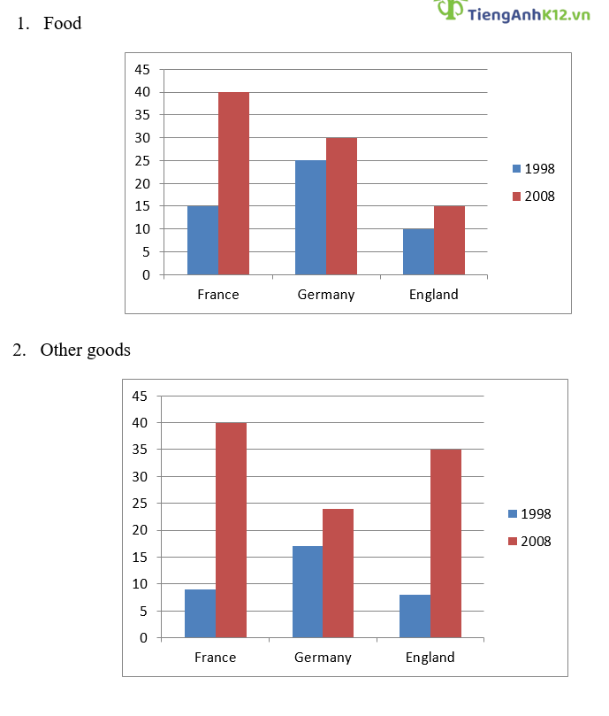
Đề bài: The charts show the percentage of income spent on food and other goods in 3 European countries from 1998 – 2008.
Bài viết tham khảo:
The given bar charts indicate the amount of money that people in 3 countries in Europe, namely France, Germany and England, spent on food and other products in 1998 and 2008.
It can be seen that those three countries saw significant increases in national purchasing power for both nourishment and other types of goods.
In 1998, French citizens allocated 15% and only around 10% of their income to buying foodstuffs and other goods, respectively. After 10 years, those figures dramatically climbed to a similar number of 40%. In Germany, there was a mild difference of 5% between the percentages of income allotted to food commodities in 1998, with 25%, and 2008, with 30%. The numbers for the other category were approximately 5% lower during the same years.
Regarding England, buyers spent only 10% on food in 1998 and 15% in 2008. Meanwhile, the figure for other goods experienced a surge from about 8% in the year 1998 and 35% in 2008.
2.2: Đề thi IELTS Writing ngày 03/03/2018:
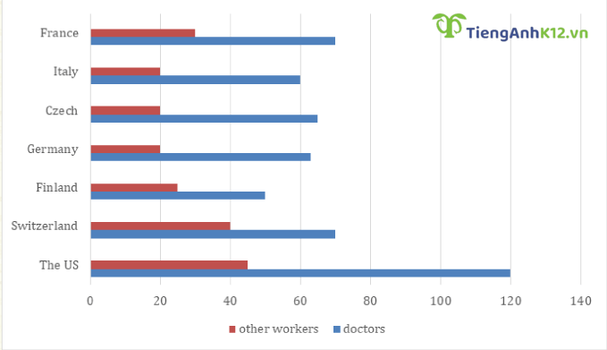
Đề bài: The chart below shows the annual pay (thousands of US dollars) for doctors and other workers in seven countries in 2004
Bài viết tham khảo:
The bar chart compares the payment each year for doctors and other workers in different nations in 2004.
Overall, the US paid the largest annual salary for both positions and also recorded the widest gap between these two figures. It also can be seen that doctors’ salaries were higher than other workers’ in both seven countries.
Regarding the chart, in 2004, annual payment for doctors in the US was 120 thousand US dollars, which nearly tripled the amount of money that other workers received. The figure for doctors in France and Switzerland were equal, at about 70 thousand US dollars, but other workers in former were paid lower than in the latter, at nearly 30 and 40 thousand US dollars respectively.
In Germany and Czech, doctors were offered roughly 65 thousand US dollars each year, compared to 60 in Italy. The lowest salary for this job was found in Finland, with only 50 thousand US dollars. Meanwhile, this nation offered a higher annual payment for other workers, at bout 25 thousand US dollars, than in Italy, Czech and Germany where they were offered equally, at 20 thousand US dollar.
2.3: Đề thi IELTS Writing ngày 06/07/2019:
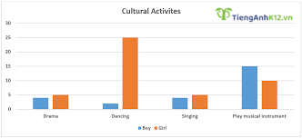
Đề bài: The charts show the percentage of boys and girls aged 5-14 taking part in cultural activities and sports in Australia in 2003.
Bài viết tham khảo:
The given bar charts illustrate the proportions of Australian boys and girls aged 5 to 14 years-old who participated in sports and different cultural activities in 2003.
In general, it can be seen that while dancing was the most popular cultural activity for girls, boys had a strong tendency for playing musical instruments. With regards to sports, a higher percentage of boys participated in sports activities compared to girls in the same age group.
In 2003, 5% of girls aged 5 to 14 participated in drama and singing activities, which was approximately 2% higher than the figure for boys in the same activities. Meanwhile, 25% of girls took part in dancing activities, compared to only 2% of boys. In contrast, the proportion of girls that played a musical instrument was only 10%, which was only two-thirds of the figure for boys in the same category.
When it came to playing sport, there was a participation rate of about 70% of 5 to 14 year-old boys, which was around 20% higher than that of girls, at just over 50%.
2.4: Đề thi IELTS Writing ngày 13/02/2020:
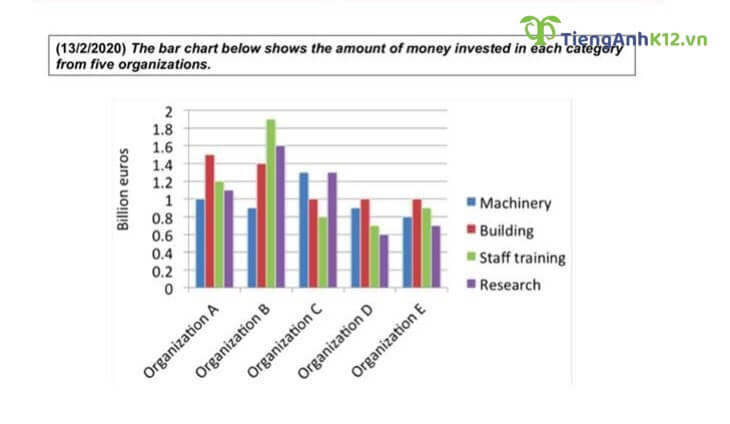
Bài tham khảo:
The given bar chart illustrates the level of investment in four categories, namely machinery, building, staff training and research, from five organizations.
Overall, the investment portfolio varies widely from organization to another, with staff training in organization B representing by far the most significant outlay. It is also obvious that the average investment in organization A, B and C is much higher than that of the other two.
In particular, organization B stands out as the biggest investor in both training employees and conducting research, with 1.9 and 1.6 billion euros respectively, while the heaviest investment in building goes to organization A with 1.5 billion euros. Both of these organizations direct the least financial resources to machinery with 0.9 billion for the former and 1 billion for the latter. In contrast, machinery, together with research, is the most sizable category in organization C, at approximately 1.3 billion, which is also the highest figure in this domain out of five companies.
With regards to organization D and E, these two have a lower financial investment in all four sectors on average, with no sector attracting more than 1 billion euros. Similar to organization A, both organizations D and E channel the largest part of their funding to building. with 1 billion euros each. However, it is not machinery but research that falls into the bottom of the investment portfolio for these two companies, with 0.6 for the former and 0.7 billion euros for the latter.
2.5: Đề thi IELTS Writing ngày 16/01/2021:
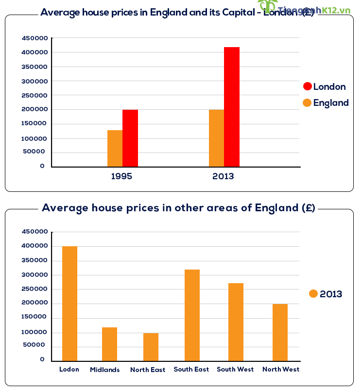
Đề bài: The graphs give information about average house prices in England and other parts of the world.
Bài tham khảo:
The bar charts illustrate how much an average house costs in England and its capital city – London, as well as comparing the average house prices between different areas of England.
Overall, citizens living in the capital had to pay far more for a house compared to the country average house price. Additionally, a standard house in London cost the most, whereas the least expensive one could be found in the North East.
In 1995, the average price of a house in London was 20,000 £, significantly higher than England’s average price, at around 13,000 £. The difference in house value between the capital and the country became even more remarkable in 2013, when London citizens typically paid higher than 40,000 £ for a house, more than double the country’s average.
In terms of costliness, houses in London stood at the top of the list. Next came South East, South West and North West, with figures at around 31,000 £, 26,000 £ and 20,000 £ respectively. By contrast, the most affordable housing was in the Midlands and North East, with average prices at only around 10,000 £.
2.6: Đề thi IELTS Writing ngày 08/05/2021:
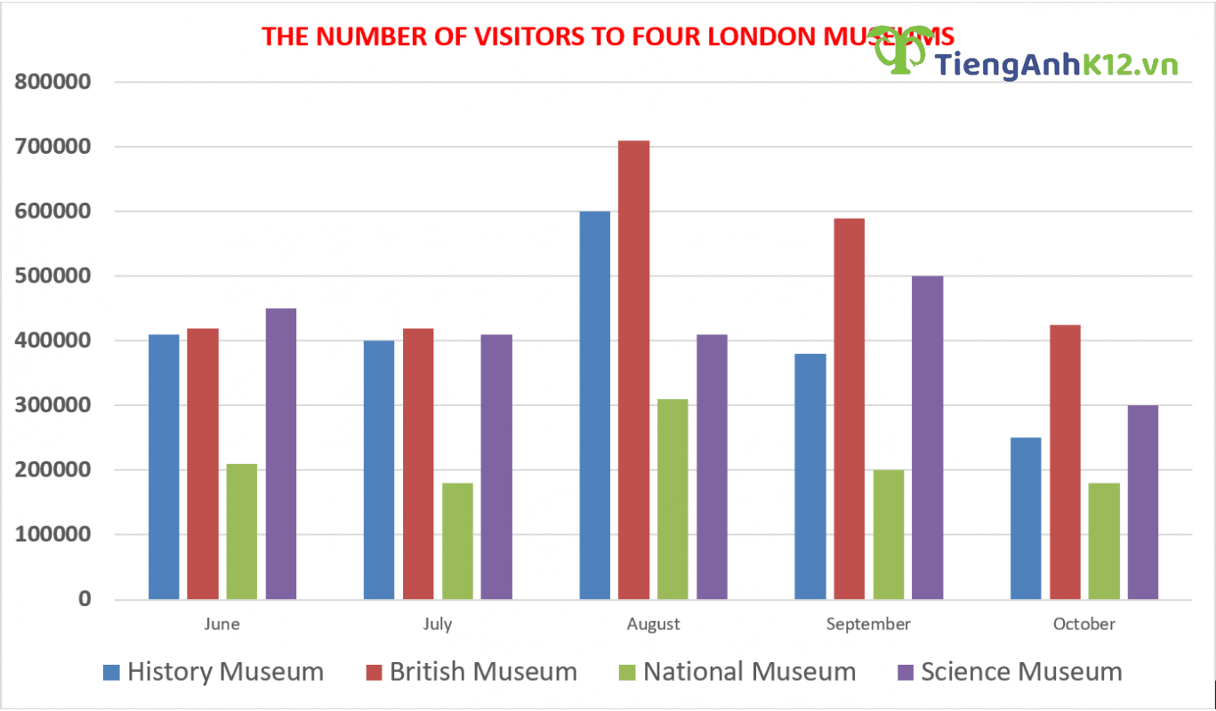
Đề bài: The bar chart below shows the number of visitors to four London museums. Summarize the information by selecting and reporting the main features, and make comparisons where relevant.
Bài viết tham khảo:
The bar chart compares the number of visits to four museums in London in five different months, namely June, July, August, September, and December. It is clear that the British Museum almost always led in popularity, whereas the National Museum was the least prevalent choice for visitors in these months. In addition, visitor numbers fluctuated over time, with August seeing the highest visitor volume in all these sites apart from the Science Museum.
In the first two months, there were hardly any changes in the popularity of the four places as the History Museum, the British Museum and the Science Museum received about 400,000 visits each, while visitor numbers to the National Museum hovered around 200,000.
However, the remaining months witnessed more remarkable changes, with the figures for the History Museum, the British Museum, and the National Museum soaring in August to peak at 600,000 visits, roughly 710,000 visits and slightly above 300,000 visits, respectively, before dropping substantially in September and December. Meanwhile, there was no change in the number of visitors to the Science Museum in August, which was followed by a marked rise to a high of 500,000 in September and a noticeable fall to merely 300,000 in December. It is worth noticing that visitor traffic to both the History Museum and the National Museum was also lowest in the last month, at only 200,000 visits, more or less.
2.7: Đề thi IELTS Writing ngày 21/05/2022:
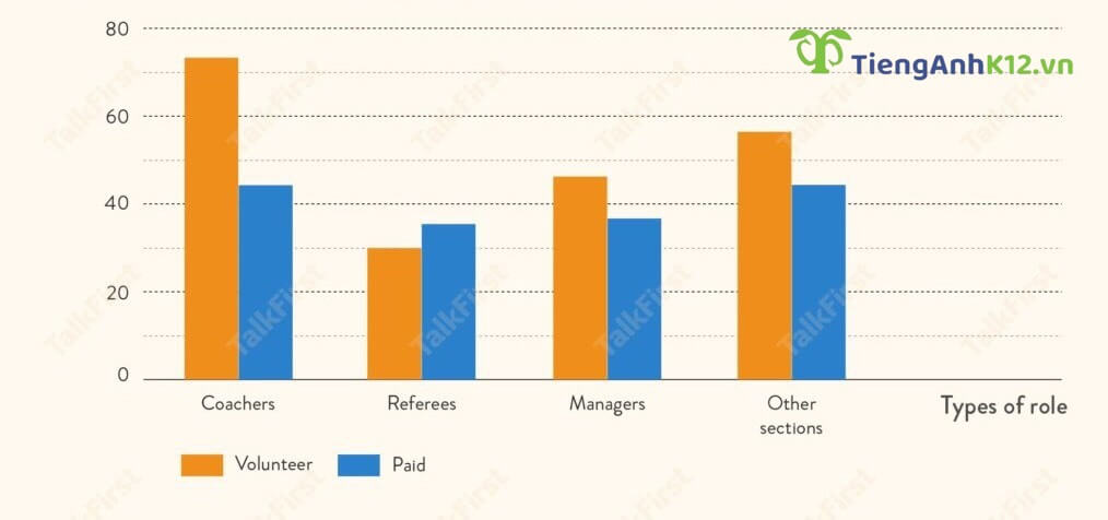
Đề bài: The bar chart shows the information of the number of volunteers and paid workers in 4 different roles in the sports sector of an Australian town in 2015.
Bài viết tham khảo:
3. Tổng hợp từ vựng thường dùng:
- As is observed, clause: Theo quan sát, …
- Generally speaking, clause: Nói chung, …
- As can be seen, clause: Như có thể thấy, …
- At a first glance, clause: Thoạt nhìn, …
- Overall, clause: Nhìn chung, …
- Rise/Increase: tăng lên
- Fall/Decrease: Giảm đi
- Remain stable: Không thay đổi
- Fluctuate: Dao động
- Hit the highest point: Đạt điểm cao nhất
- Dramatically: Đáng kể
- Slight: Không đáng kể
- Respectively/Correspondingly: Tương ứng
- Between … and …: giữa … và …
- From… to …: từ … đến …
- Increase/Fall to + số liệu: Tăng/Giảm đạt đến số liệu bao nhiêu
- Increase/Fall by + phần trăm: Tăng/Giảm bao nhiêu phần trăm
Trên đây là tổng hợp của TAK12 về các đề IELTS Writing Task 1 dạng bài Bar Chart trong những năm vừa qua. Ngoài việc nắm được các bước làm bài qua các đề minh họa, em cũng cần học và vận dụng thành thạo các nhóm ngôn ngữ miêu tả sự tăng – giảm và so sánh số liệu để tối ưu được điểm số ở phần Từ vựng và Ngữ pháp.
[%Included.IELTS%]