Tổng hợp đề thi IELTS Writing Task 1 dạng bài Pie Chart
Đề thi IELTS Writing task 1 dạng bài Pie Chart đã không còn xa lạ với những bạn đang chuẩn bị cho kỳ thi IELTS. Tuy nhiên không phải ai cũng hiểu và nắm được cách làm của dạng bài này. Hôm nay, hãy cùng TAK12 tổng hợp lại các đề thi IELTS Writing task 1 dạng bài Pie Chart được sử dụng trong những năm gần đây. Hy vọng bài viết sẽ đem đến cho các bạn cái nhìn khách quan nhất về dạng bài này.
1. Tổng quan về biểu đồ Pie Chart
Dạng Pie Chart (Biểu đồ tròn) biểu thị tỷ lệ phần trăm của nhiều đối tượng, hay nhiều thành phần của một đối tượng. Biểu đồ tròn thường có số lượng từ 2 đối tượng trở lên, có thể có yếu tố thời gian hoặc đại diện cho từng đối tượng cụ thể.
Biểu đồ Pie Chart chia ra hai loại:
- Loại thứ nhất: Đề bài chỉ có một biểu đồ tròn duy nhất (Loại này tương đối ít gặp)
- Loại thứ hai thường gặp hơn – đề bài có sự biến đổi theo thời gian. Loại này thường biểu thị sự lên xuống về giá trị theo thời gian của các hạng mục được biểu thị. Loại thứ hai khá phức tạp và khó xử lý hơn nhiều so với loại thứ nhất.
Các bước viết dạng bài Pie Chart:
1. Intro: Giới thiệu sơ lược về Pie chart, chúng ta có thể paraphrase lại đề bằng những từ hữu ích đã đề cập ở trên.
2. Overview:
- Đối với dạng pie chart không có timeline: Ta có thể nêu phần nào trên biểu đồ chiếm nhiều nhất và ít nhất.
- Đối với dạng pie chart có timeline (ví dụ 2 biểu đồ tròn có 2 năm): Ta có thể nêu sự thay đổi tăng-giảm giữa các biểu đồ tròn.
3. Body: Phân tích chi tiết về những thông tin có trong biểu đồ. Đối vơi dạng biểu đồ có 1 pie chart, việc phân tích có thể gói gọn trong 1 đoạn, còn đối với dạng pie chart có 2 biểu đồ trở lên, có thể dùng 1 hoặc 2 đoạn tùy vào cách hành văn của người viết.
2. Những dạng đề đã được sử dụng trong những năm gần đây
2.1: Đề IELTS Writing Task 1 ngày 25/11/2017

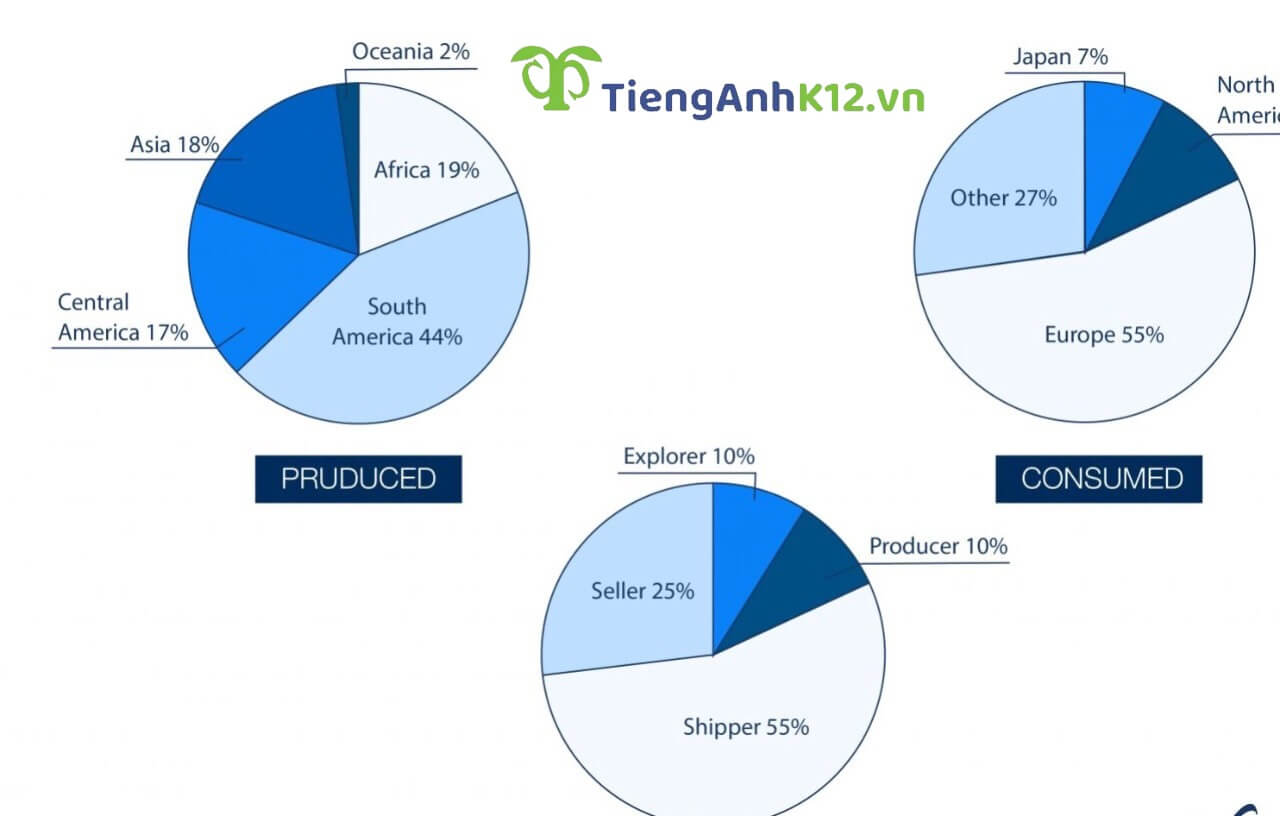
Đề bài: The pie charts below show information about where coffee is produced, consumed & where its profit goes
Bài viết tham khảo:
The provided pie charts illustrate the production and consumption of coffee as well as the distribution of the profit concerned. Overall, South America is the most productive region, Europe is the greatest consumer, and shippers enjoy the highest amount of financial return.
Firstly, in terms of production figures, South America is the highest (44%), followed by Africa, Asia and Central America (19%, 18% and 17% respectively), leaving Oceania far behind (2%). As for consumption, the top two proportions are associated with Europe (55%) and other regions/countries (27%) whereas those of North America (11%) and Japan (7%) are much lower. Interestingly, Europe and North America do not produce coffee but their consumption is significant.
When it comes to profit earners, explorers and producers gain only 10% each while shippers and sellers are the greatest beneficiaries (55% and 25% in the same order). Again, those who sell and ship coffee products are not involved in the production process, but together they earn 80% of the total profit.
2.2: Đề IELTS Writing Task 1 ngày 10/02/2018

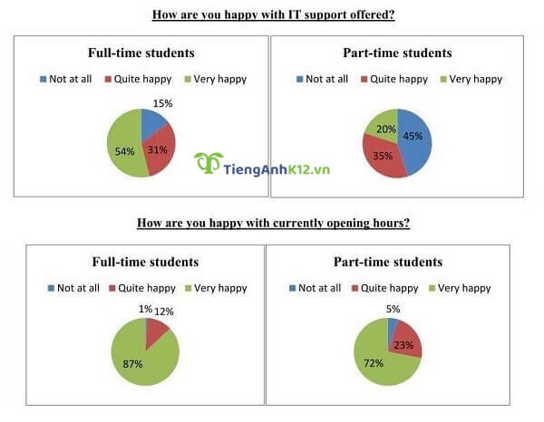
Đề bài: The pie charts show the results of a survey conducted by a university on the opinions of full-time and part-time students about its services.
Bài viết tham khảo:
The pie charts compare the opinions of full-time and part-time students about services of their university including IT support and opening hours.
Overall, it is clear that the opening hours received more positive feedback than the IT support. Also, full-time students tended to be more satisfied with the two services than their part-time counterparts.
Regarding IT support, over half of surveyed full-time students said that they were very happy with this service, while only a fifth of part-time students reported that they were very happy. In contrast, just 15% of the students studying full-time were not satisfied with IT support, in comparison with 45% of their counterparts. The proportion of both kinds of students being quite happy with this service was relatively the same, at about a third.
The majority of full-time and part-time students felt happy with the current opening hours, with 87% and 72% respectively. Only 1% of the examined full-time students were not satisfied with the opening hours whereas the figure for part-time students was a little higher, at 5%. The remaining 12% of the surveyed full-time students felt quite happy with this service, as opposed to nearly a quarter of their part-time counterparts.
2.3: Đề IELTS Writing Task 1 ngày 24/03/2018
.jpg)
Đề bài: The charts below show the percentage of people aged 23-65 in different occupations in one UK town (Ashby) and in the UK as a whole in 2008
Bài viết tham khảo:
The charts indicate the proportion of people in the 23-65 age group in different jobs in Ashby and in the UK as a whole in 2005. Overall, it is apparent that the overall unemployment rate of this town was higher than that of the UK, and that the largest proportion of workers in Ashby was in personal services, while office work was the most popular for the UK as a whole.
Upon closer inspection, we can see that while the most popular job in Ashby i.e. personal services constituted 21% of the workforce, this only accounted for 17% of the national UK economy. However, while the largest proportion of the average UK working population did office work at 19%, this figure was slightly lower at 18% in Ashby. Moreover, there were two other sectors where Ashby had a lower proportion of workers employed than the whole of the UK: technical work and professional work.
Whereas technical and professional workers make up 17% and 14% of the UK workforce respectively, this figure stood at only 9% and 8% in Ashby. On the other hand, construction work took up a larger slice of Ashby’s occupations, making up 16% compared to the UK’s average of 10%. Lastly, the percentages of people working in shops in Ashby and the UK showed a minor disparity with their figures being 14% and 13%, respectively
2.4: Đề IELTS Writing Task 1 ngày 19/01/2019
.jpg)
Đề bài: The charts below show the percentage of volunteers by organizations in 2008 and 2014.
Bài viết tham khảo:
The pie charts show the proportions of people volunteering in various kinds of organizations in 2008 and 2014.
It is clear that while volunteers’ participation in environmental, sport, and health care organizations increased, the opposite was true for other types of organizations. Additionally, the percentages of health care volunteers were by far the lowest during the two years.
In 2008, volunteering in educational organizations was the most common choice, accounting for nearly a quarter of all volunteers, while 21% and 18% of volunteers took part in environmental and art projects respectively. 15% of volunteers worked in sport organizations, and another 15% in other organizations, while only 6% volunteered in health care.
In 2014, significantly more volunteers worked in environmental and sport organizations compared with the other fields, at 29% and 25% respectively. Meanwhile, the figures for art and other volunteers both fell by 6%. There was also a slight fall in volunteers in educational organizations, at 17%, while volunteering in health care was still the least preferred option, at only 8%.
2.5: Đề IELTS Writing Task 1 ngày 19/12/2020
.jpg)
Đề bài: The charts below show how students in three countries choose to learn English in 2010 and 2015. Summarize the information by selecting and reporting the main features and make comparisons where relevant.
Bài viết tham khảo:
The three pie charts illustrate the changes in the ways of the learners studying English in different countries (A, B, and C) from 2010 to 2015.
Overall, the data indicate that the most significant time of learning English in all three countries was the daytime over the 5-year period. People who lived in countries A and C selected to study English at nighttime, whereas those in country B experienced this subject through online courses.
In terms of country B, persons who learned English in the daytime and night-time comprised of 53% and 33% respectively in the first year, and these data showed a very slight decrease in 2015 (to 50% and 20% respectively). In contrast, the online method of learning English began at only 14% in 2010 and then it sharply increased to 30% in 2015.
With regards to the remaining countries of studying English, it is clear that the percentages of people who studied English by the daytime in both nations were almost likely unchanged more until 2015 (50%). However, the time of night in country A and the time of online in country C together significantly increased by about 15% after five years, whereas the time of online in country A and the time of night in country C considerably decreased by about 15% after five years.
2.6: Đề IELTS Writing Task 1 ngày 25/11/2021:

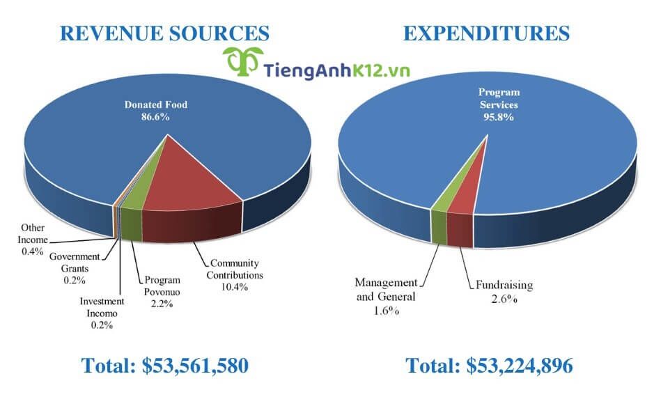
Đề bài: The pie chart shows the amount of money that a children’s charity located in the USA spent and received in one year, 2016. Summarize the information by selecting and reporting the main features and make comparisons where relevant.
Bài viết tham khảo:
The charts illustrate the sources of revenue of a children’s charity organization in the U.S and how they allocated the money for different purposes in 2016.
Overall, most of their funding came from Donated Food, followed by community contributions. In addition, the vast majority of spending was used for operating program services.
In 2016, the charity received money from six main sources, and the most extensive sum of donation came in the form of donated food (86.6%). Despite being significantly lower than the food donations, community contributions were the second highest source of revenue, at 10.4%. Program Povonuo contributed 2.2% of revenue, while investment income government support, and other income accounted for only 0.8% in total.
Meanwhile, program services made up almost 96% of the total expenses in 2016. Fundraising was 2.6% of the overall expenses, while 1.6% was allocated to management and general. Additionally, while the total revenue of the charity was $53,561,580, the organization managed to save around $370,000.
2.7: Đề IELTS Writing Task 1 ngày 09/07/2022:

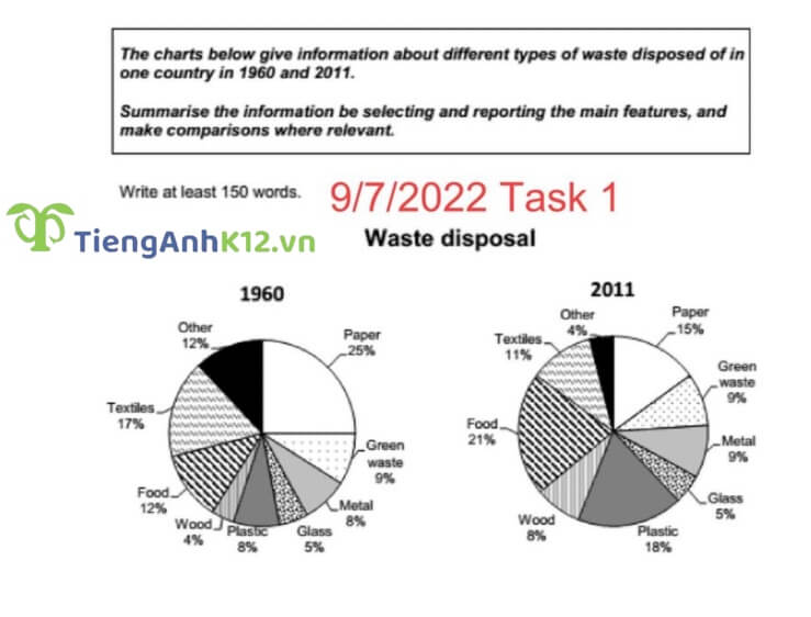
Đề bài: The charts below give information about different types of waste disposed of in one country in 1960 and 2011.
Bài viết tham khảo:
The given pie charts illustrated data on waste disposal of various categories in a nation in 1960 and 2011.
Overall, it can be seen that there was an increase in the proportion of plastic, wood and food disposal while people threw away less paper, textile and other types of waste. In addition, disposed metal, glass and green waste shared almost the same figure in two years.
In 1960, 25% of paper was discarded but this percentage fell by 10% in 2011. Regarding textiles, this category also experienced a slight decline of 6% (from 17% to 11%) in the same time frame. Besides, the amount of other waste got rid of in 2011 was 3 times lower than that in 1960.
It is clear that the proportion of plastic and food waste grew by roughly 10% in 2011 compared to the other year. And people disposed of a two-fold amount of wood 51 years after 1960.
In terms of glass, metal and green waste, these types of disposal shared almost constant figures over the period. Specifically, the two latter types’ disposal were approximately 9% while the percentage of glass thrown away was only 50%.
3. Các từ vựng trong các bài mẫu trên
- Environmental pollution: ô nhiễm môi trường
- Illegal immigration: nhập cư bất hợp pháp
- Terrorism: khủng bố
- Poverty: sự đói nghèo
- Racism: nạn phân biệt chủng tộc
- Domestic violence: bạo lực gia đình
- Overpopulation: sự bùng nổ dân số
- Gun ownership: quyền sở hữu súng ống
- Juvenile delinquency: tội phạm vị thành niên
- Human rights: nhân quyền
- Human exploitation: sự khai thác con người
- Social inequality: bất bình đẳng xã hội
- Political unrests/Political conflicts: những bất ổn/mâu thuẫn về chính trị
- Same-sex marriage: hôn nhân đồng tính
- Brain drain: tình trạng chảy máu chất xám (chỉ sự di cư của lực lượng lao động được đào tạo, có trình độ chuyên môn cao từ nước nghèo sang các nước giàu)
- Teen suicide: tình trạng tự tử trong giới trẻ
- Abortion: tình trạng nạo phá thai
- Prostitution: nạn mại dâm
- Ongoing problem: vấn đề đang diễn ra
- Pervasive problem: vấn đề đang diễn ra ở khắp nhiều nơi, có tính lây lan
- Insurmountable problem: vấn đề nan giải
- Daunting problem: vấn đề dễ làm nản chí
- Outstanding problem: vấn đề tồn đọng
Trên đây là tổng hợp của TAK12 về các đề IELTS Writing Task 1 dạng bài Pie Chart trong những năm vừa qua. Việc tham khảo bài mẫu khi luyện cách viết Pie chart trong IELTS Writing task 1 có thể giúp cho thí sinh trau dồi thêm những cấu trúc câu và cách phân tích đề bài thuần thục hơn.
[%Included.IELTS%]