Tổng hợp đề thi IELTS Writing Task 1 dạng bài Mixed Charts
Trong bài viết này, TAK12 sẽ tổng hợp những mẫu đề IELTS Writing task 1 dạng bài Mixed Charts được hỏi trong các đề thi IELTS Writing những năm gần đây. Hy vọng thông qua bài viết, có thể giúp các bạn nắm được cách thức làm bài và hiểu rõ được cấu trúc dạng đề Mixed Charts.
1. Tổng quan về dạng đề Mixed Charts
1.1: Khái niệm về Mixed Charts:
Dạng bài Mixed Charts IELTS Writing Task 1 là dạng bài có sự kết hợp của 2 loại biểu đồ được thể hiện ở hình thức biểu đồ khác nhau và cung cấp loại thông tin khác nhau.
Thông thường mỗi bảng biểu hay sơ đồ trong dạng bài Mixed chart IELTS Writing Task 1 sẽ mô tả những thông tin, dữ liệu khác nhau. Người viết cần phải khái quát lại những thông tin được cung cấp, so sánh các thông tin đó, tìm ra điểm giống và khác giữa chúng để rút ra mối liên hệ giữa các bảng biểu, sơ đồ đó.
1.2: Các dạng biểu đồ kết hợp:
- Dạng Pie chart kết hợp với Table
- Dạng Line chart kết hợp Table
- Dạng Bar chart kết hợp Table
- Dạng Pie chart kết hợp Line chart
- Dạng Pie chart kết hợp Bar chart
- Dạng Line chart kết hợp Bar chart
1.3: Các bước làm bài:
Bước 1: Phân tích đề bài: Đây là một bước rất quan trọng, giúp bạn xác định được yêu cầu của đề bài và ghi nhớ những thông tin được cung cấp trong đề bài.
Bước 2: Xác định Outline: Với dạng bài Mixed chart IELTS Writing Task 1, bố cục của bài viết sẽ bao gồm 3 phần chính: Introduction, Overview và Body. Riêng phần Body, bạn sẽ chia ra làm 2 paragraph để phân tích từng biểu đồ, bảng biểu.
Bước 3: Tiến hành viết từng đoạn: Ở bước này, bạn cần xác định rõ nhiệm vụ, mục đích của từng đoạn trong bài Mixed chart. Bên cạnh đó, hãy chọn lựa và áp dụng những cấu trúc câu và từ vựng phù hợp để đạt được band điểm cao trong IELTS Writing Task 1.
Bước 4: Đọc và sửa lỗi: Đây là một bước rất quan trọng nếu bạn muốn bài viết của mình thật chỉn chu và không mắc phải các lỗi mất điểm oan như sai chính tả, sai ngữ pháp,...
[%Included.Dangky.Ielts%]
2. Tổng hợp đề thi Mixed Charts những năm qua:
2.1 Đề thi IELTS Writing Mixed Charts ngày 14/04/2018:
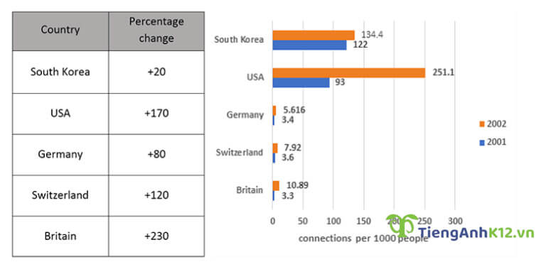
Đề bài: The chart below gives information about the high-speed continuous internet connection of households in five countries in 2001 and 2002
Bài viết tham khảo:
The bar chart and table compare five countries in terms of the percentage of families with high-speed internet access, and the change over two consecutive years, from 2001 to 2002.
It is clear that the percentage of families with high-speed internet connection was highest in South Korea and the USA during those years. In addition, the biggest change in the number of families with high-speed internet access occurred in Britain.
In 2001, about 11.2% of South Korean households had access to high-speed internet, compared to 9.3% of US families. One year later, the number of US families with high-speed internet soared by 170% to reach 25.11% of the population, which was the highest figure of all measured countries for those years. By contrast, the growth rate was significantly lower in South Korea, at only 20%.
High-speed internet was not as common in Germany, Switzerland and Britain, with only roughly 0.35% of households having a high-speed connection. All three countries saw significant increases over the year, with Germany and Switzerland witnessing increases of 80% and 120% respectively. Meanwhile, Britain saw the biggest growth rate in high-speed internet connections with a 230% increase.
2.2: Đề thi IELTS Writing Mixed Charts ngày 30/11/2019:
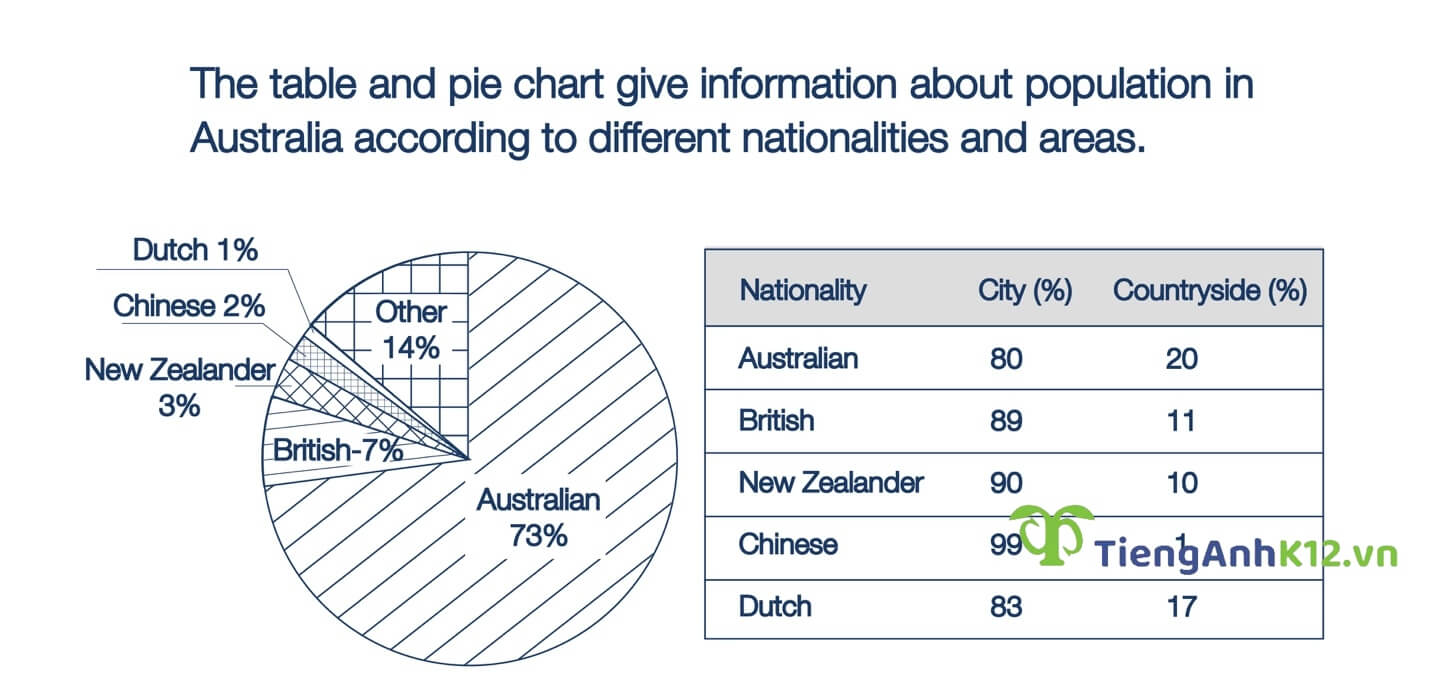
Đề bài: The Pie chart gives information about the country of birth of people living in Australia and the table shows where people born in these countries live
Bài viết tham khảo:
The given pie chart illustrates the percentage of people of different nationalities residing in Australia, whereas the table shows demographical figures which are classified according to urban and rural areas. The initial impression from the pie chart is that the vast majority of Australian people claim their ancestry to be of Australian origin. It is also noticeable that most Australian people, regardless of their ethnicity, are city dwellers.
According to the pie chart, Australian ethnicity makes up nearly three-fourths of the total population. This is followed by the figure for people coming from the UK (7%) and New Zealand (3%). People of Chinese and Dutch ethnicity, on the other hand, make up a negligible 1-2%.
As is seen from the table, roughly 80% of people from Australia and New Zealand live in cities, whereas only around 20% live in the countryside. A similar picture is evident in the figures for people from China and New Zealand, with their urban population amounting to a high of 90-99%.
2.3: Đề thi IELTS Writing Mixed Charts ngày 21/11/2020:
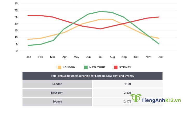
Đề bài: The graph and table below show the average monthly temperatures and the average number of hours of sunshine per year in three major cities.
Bài viết tham khảo:
The line graph and the table give data on average temperatures and yearly hours of sunshine in London, New York and Sydney.
Overall, the temperature patterns for London and New York are similar with the hottest weather being in July while the highest average temperature in Sydney is in January. The sunshine hours in New York and Sydney are nearly the same and much higher than the figure for London.
Looking at the monthly average temperatures in more detail, the changes in temperatures in London and New York show a similarity although the city in North America has warmer summers and colder winters. The average temperatures in both London and New York respectively peak at 23 degrees and 29 degrees in July, whereas January is the month when Sydney experiences the warmest weather with 25 degrees. New York’s temperatures decrease to an average of around 5 degrees in December/January, 3 degrees lower than the figure for London, while Sydney shows the lowest average temperatures in July, reaching just over 15 degrees.
2.4: Đề thi IELTS Writing Mixed Charts ngày 13/06/2020:
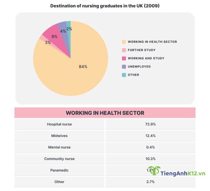
Đề bài: The chart and table below give information about what nursing graduates did after finishing their course in the UK in 2009.
Bài viết tham khảo:
The pie chart details the destination of nursing graduates whilst the table gives a closer look at the statistics regarding workers in health sector in the UK in 2009.
As can be seen from the graph, a vast majority of nursing graduates decided to join health workforce, whereas very few preferred to pursue tertiary education or switch to other jobs. Meanwhile, the table reveals that working as a hospital nurse was the destination of many graduates.
Regarding the pie chart, participating in health sector was the most popular choice among nursing graduates, accounting for 84% of total people in the report. Working and study made up much smaller shares with 8%, whilst 4% of graduates were reported to be unemployed. At the same time, a negligible 2% pursued further study, and another 2% worked in other fields after graduation.
The table shows that most graduates who chose to work in health sector favoured nurse positions in hospitals, representing nearly three-fourths of the total surveyed people. In second place was midwifery jobs with 12.4%, which was followed by community nurse positions with 10.3% of total participants. Last came graduates employed in other, paramedic and mental nurse roles, accounting for a negligible 2.7%, 1.3% and 0.4% respectively.
2.5: Đề thi IELTS Writing Mixed Charts ngày 16/05/2020
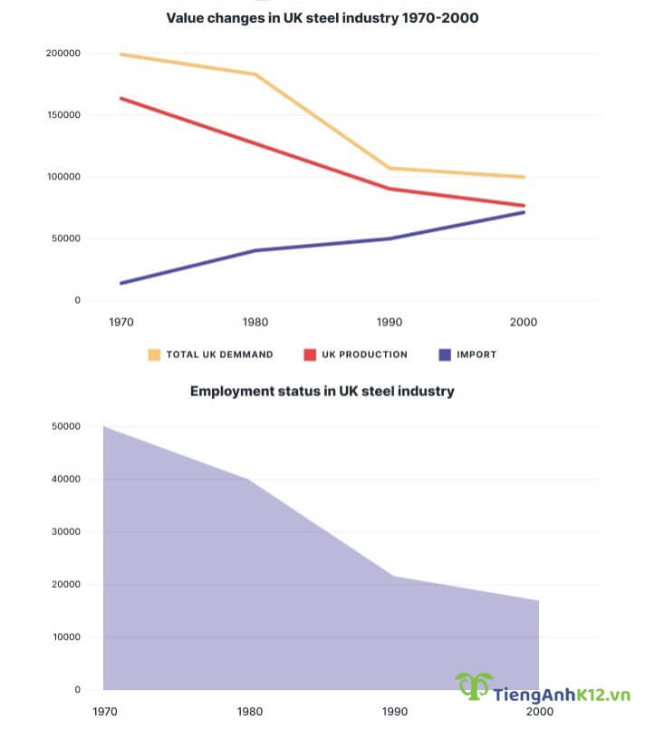
Đề bài: The graphs show the changes in the UK industry steel between 1970 and 2000. (đơn vị milliontonnes vs thousand)
Bài viết tham khảo:
The charts detail value changes in the steel industry and the number of workers employed in the UK between 1970 and 2000.
A glance at two graphs shows that with the exception of steel import total demand for production and demand for employment all underwent a drastic downturn. Another interesting highlight is that the UK only started to import steel after 1970.
At the beginning of the period, the production of steel in the UK was the highest at around 165,000 tonnes; however, this number was nowhere to meet the total demand for this product at 200,000 tonnes. Steel import, at this time, was nearly zero. Over a 30-year period, both total steel demand and production halved year-on-year, finishing at 100,000 tonnes for the former and approximately 80,000 tonnes for the latter. Meanwhile, the year of 2000 recorded a steady rise of 75,000 tonnes in the import values, slightly lower than the production of steel.
With respect to the workforce, there were 50,000 employees in this industry in 1970, and there seemed to be a corresponding decline in this figure as the total demand dropped over the years. With a steep dip from 40,000 to just above 20,000 between 1980 and 1990, the number of the labour force hit its trough of roughly 170,000 in 2000.
2.6: Đề thi IELTS Writing Mixed Charts ngày 21/01/2021:
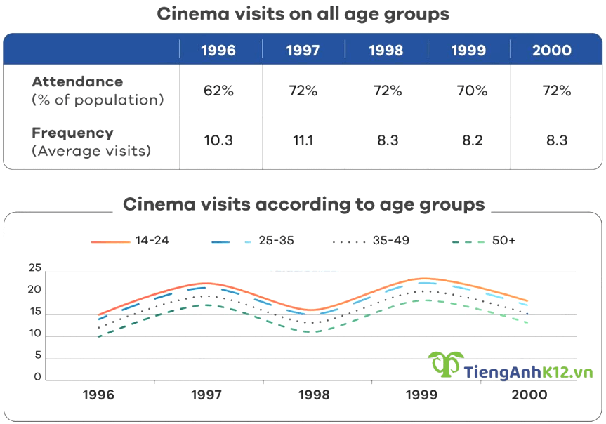
Đề bài: The graphs below show the cinema attendance in Australia and the average cinema visits by different age groups from 1996 to 2000.
Bài viết tham khảo:
The table shows statistics on cinemagoers regardless of age between 1996 and 2000, whereas the line graph depicts how often Australian people of different ages went to the cinema during the same period.
Overall, it is clear that despite a gradual dip in frequency, there was a sharp rise in cinema attendance over the years. On the whole, the younger the attendants were, the more likely they were to enjoy visiting the cinema.
In 1996, cinema attendance accounted for 62% of the total Australian population. This figure then went up quickly to 72% a year later before fluctuating around 71% until 2000. The number of average visits, on the other hand, recorded a negligible increase from 10.3 in 1996 to 11.1 in 1997, followed by a drop to 8.3 in 2000.
With regard to the number of cinema visits, these figures reflected similar fluctuating trends throughout the years with two peaks in 1997 and 1999. Going to the cinema appeared to be a popular activity among younger demographics as people from 14 to 24 paid 15 visits on average in 1996, followed by people aged 25-35 (14 visits), 35-49 (12.5 visits) and over 50 with only 10 visits. Aside from peaks reached in 1997 and 1999, the figures for 4 age brackets also experienced a dip in 1998 before finishing at the same ranks at around 18 visits for 14-24 age group, 17 visits for 25-35 group, 15 for 35-49 group and just below 14 for over 50 group.
3. Từ vựng xuất hiện trong các bài tham khảo trên:
- gain increasing popularity: càng ngày càng phổ biến
- instrumental in: la một phần thiết yếu
- destitution (n.): sự nghèo đói cùng cực
- plagued (adj.): bị tàn phá
- inflation (n.): lạm phát
- financial relief: sự hỗ trợ tài chính
- oblige (v.): buộc ai
- demand for employment: nhu cầu tuyển dụng
- undergo a drastic downturn: giảm mạnh
- the former...the later: cái nhắc tới trước...cái nhắc tới sau
- halved year-on-year: vơi một nửa so với năm trước
- finish at 100,000 tonnes: dừng lại ở 100,000 tấn
- record a steady rise: tăng đều đặn
- with respect to something: về vấn đề gì đó
- a corresponding decline: giảm tương ứng
- a steep dip: giảm mạnh
- hit its trough: giảm tới mức thấp nhất
- steel import: nhập khẩu thép
- total demand: tổng nhu cầu
Trên đây là tổng hợp của TAK12 về các đề IELTS Writing Task 1 dạng bài Mixed Charts trong những năm vừa qua. Hy vọng bài viết giúp các bạn hiểu được các bố cục và cách viết bài dạng này, sẵn sàng tinh thần cho kỳ thi IELTS Writing.
[%Included.IELTS%]